High-End Design. Advanced Commerce
Refined, Minimal Shopify Theme for High-End eCommerce Brands
Designed with a refined visual approach and a feature-rich foundation, the theme delivers a seamless shopping experience tailored for premium online retail.

Minimalistic Design
Clean layouts, balanced spacing, and organized content structure designed to keep products easy to browse and visually clear across every page.
Modern Look
Contemporary typography, refined storefront layouts, and responsive design elements built for today’s modern online shopping experience.
Feature-Packed
Advanced filtering, flexible product tools, and built-in merchandising features designed to support growing Shopify stores of any size.
ready-made presents
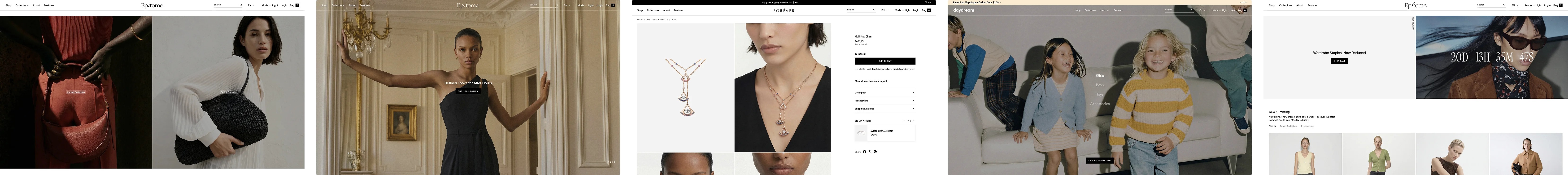
Five Ready-to-Use Presets
Start with one of the included presets, then customize layouts and elements to match your store’s presence.
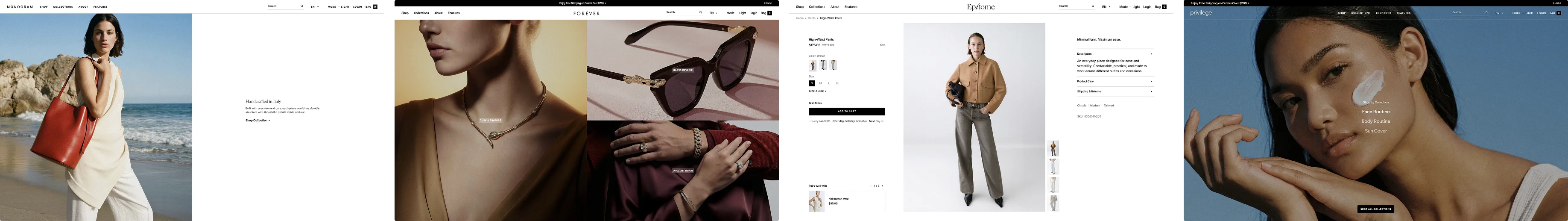
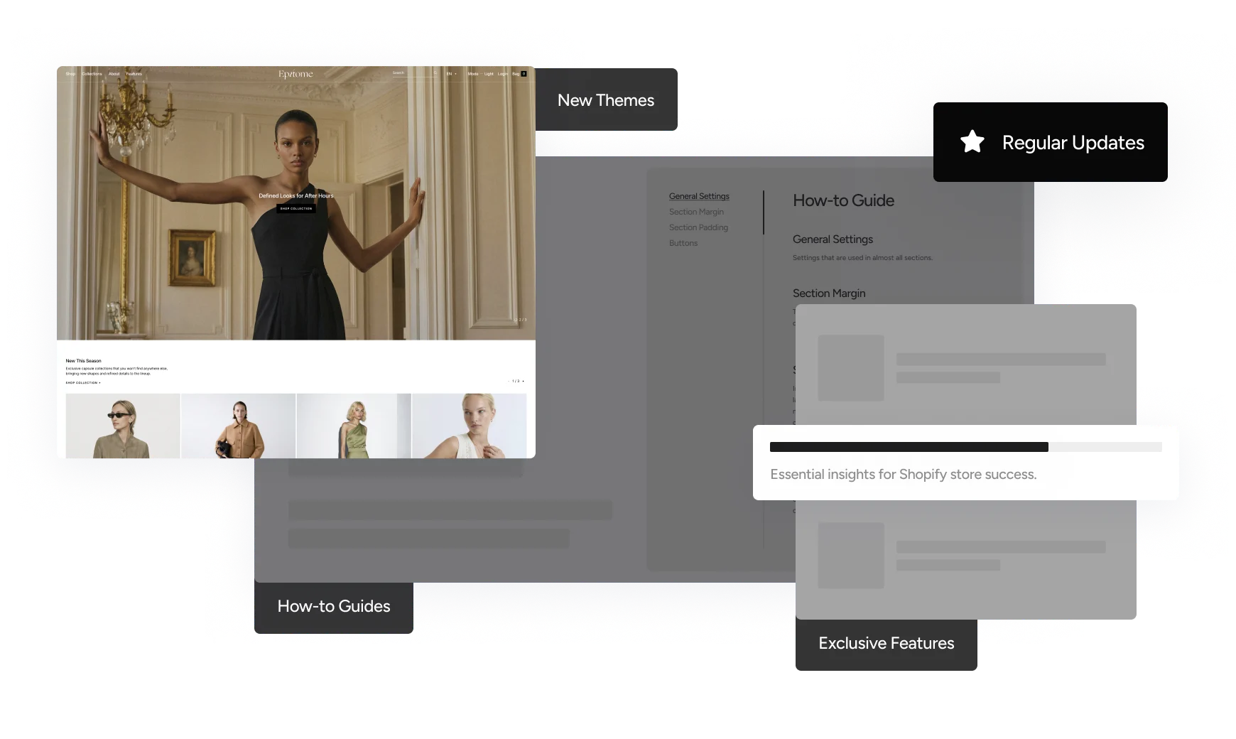
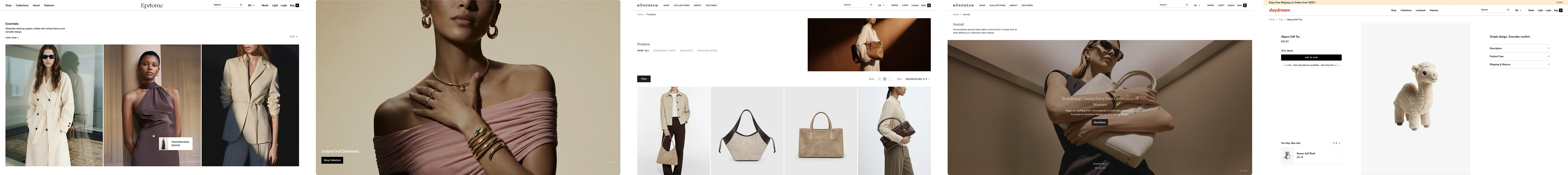
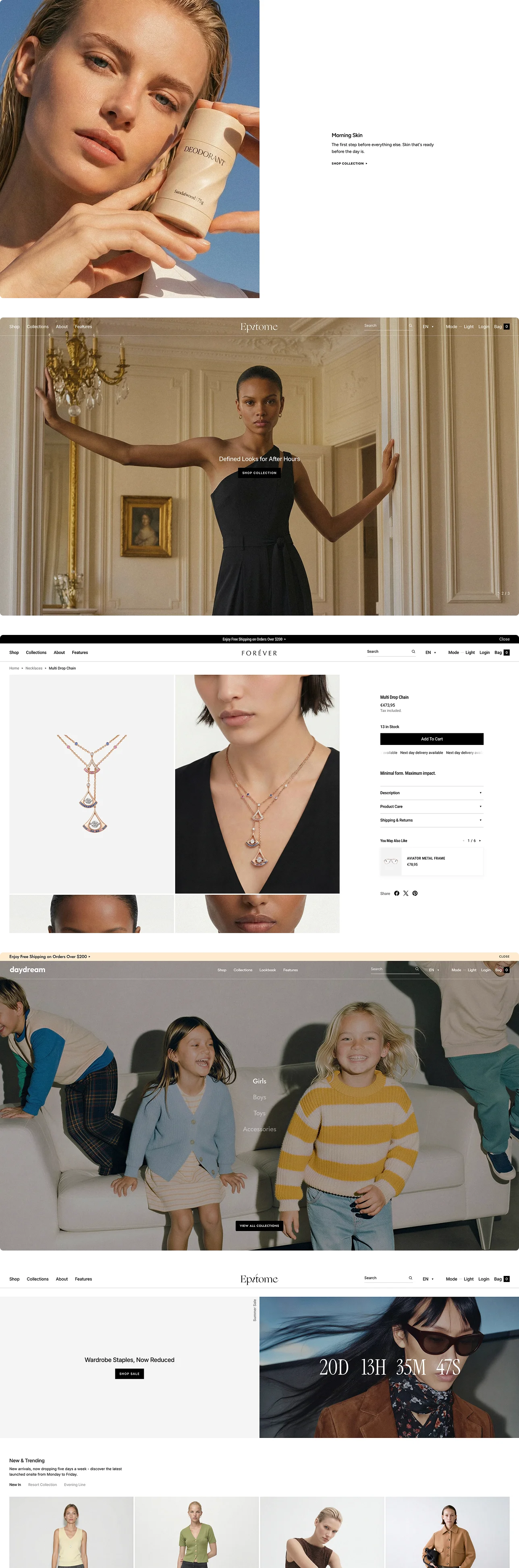
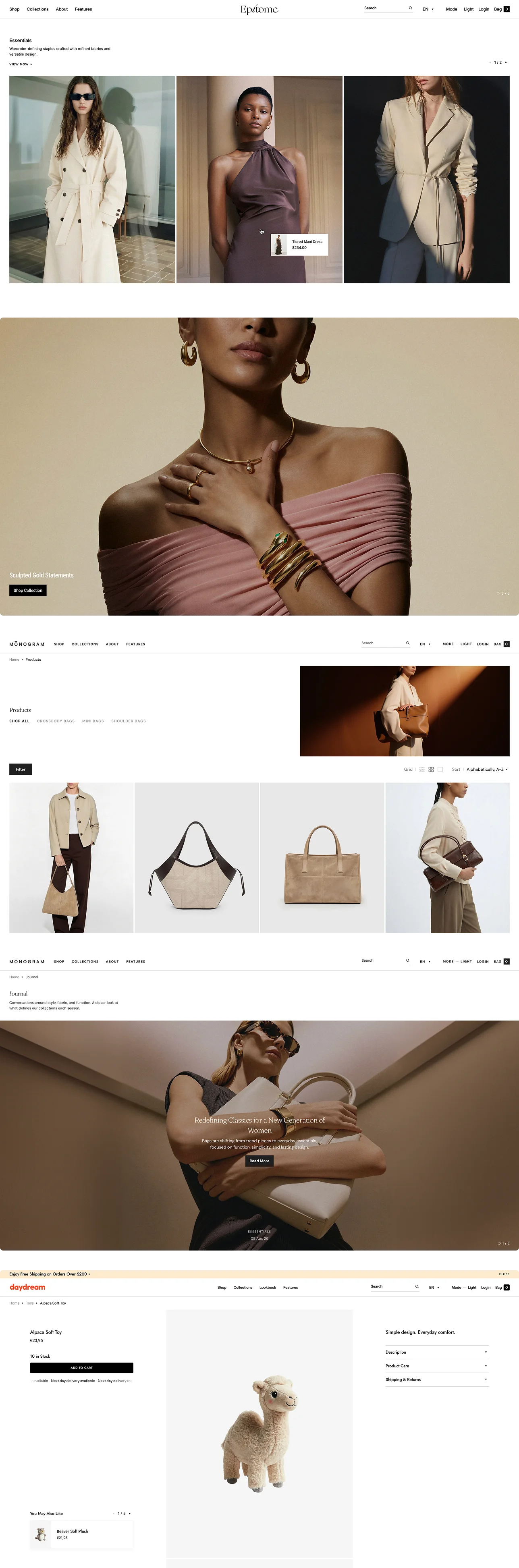
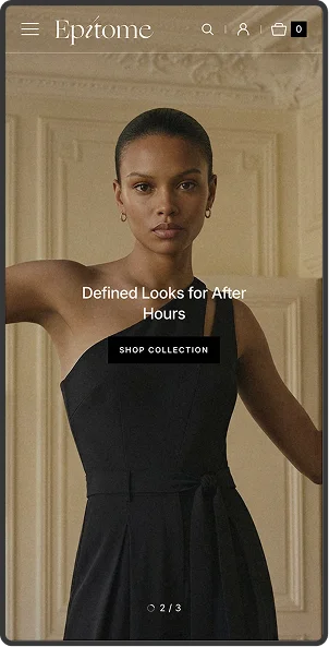
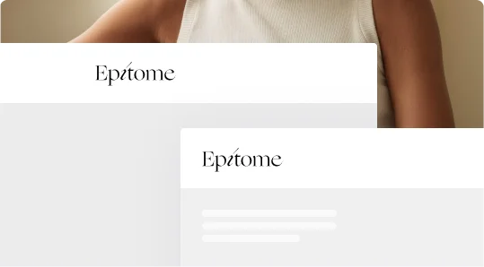
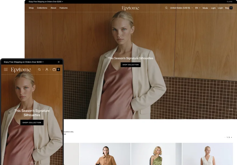
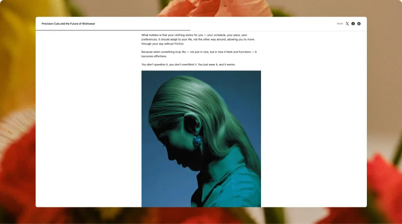
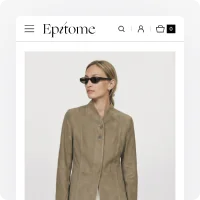
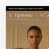
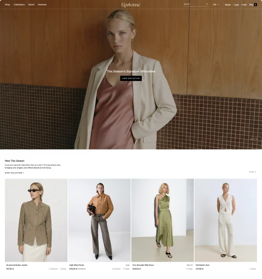 Epitome
Clothing
An apparel-focused storefront with editorial layouts, large imagery, and structured product presentation.
Epitome
Clothing
An apparel-focused storefront with editorial layouts, large imagery, and structured product presentation.

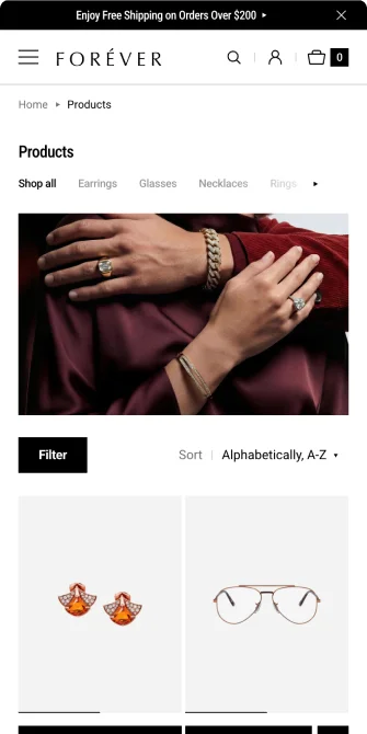
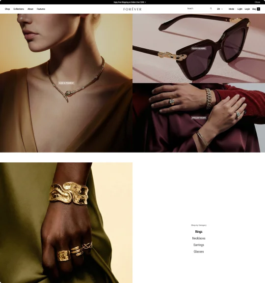 Forever
Jewelry
A jewelry storefront built around close-up visuals, curated collections, and clean shopping flows.
Forever
Jewelry
A jewelry storefront built around close-up visuals, curated collections, and clean shopping flows.

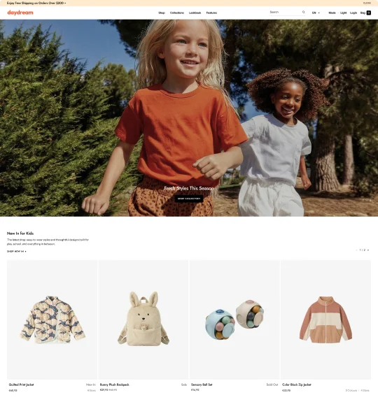 Daydream
Kids
A playful kids storefront with soft colors, organized layouts, and image-driven collection sections.
Daydream
Kids
A playful kids storefront with soft colors, organized layouts, and image-driven collection sections.

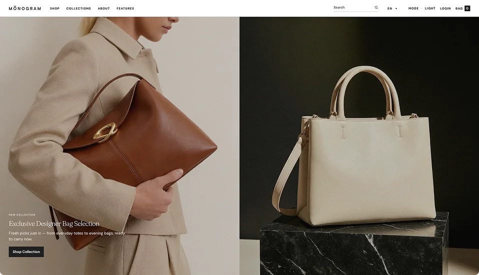
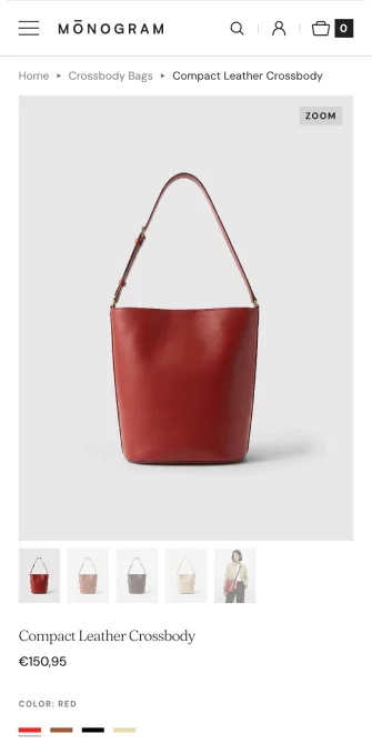
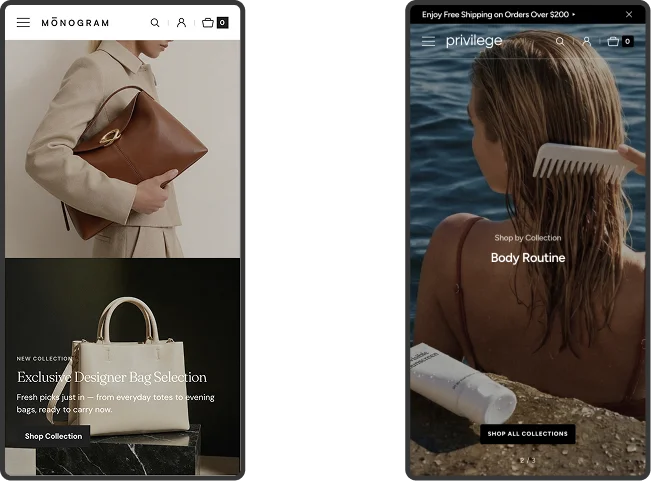
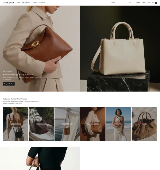 Monogram
Bags
A bags and accessories storefront built around bold imagery, structured grids, and visual merchandising.
Monogram
Bags
A bags and accessories storefront built around bold imagery, structured grids, and visual merchandising.

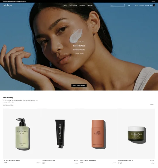 Privilege
Beauty
A skincare storefront designed for collections, campaign visuals, and product-focused browsing.
Privilege
Beauty
A skincare storefront designed for collections, campaign visuals, and product-focused browsing.

Lifetime Access
Single Purchase with No Recurring Fees
Make a one-time purchase and gain access to 5 presets, plus regular updates and lifetime support—no hidden fees or additional charges.
Media Section
Strong First Impression with
High-Impact Hero Layouts
The flexible hero section lets you seamlessly showcase campaigns, featured collections, videos, and promotional content across multiple layout styles.
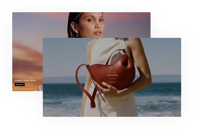
Slideshow Hero
Feature campaigns, collections, or promotions in a rotating layout designed to keep storefronts visually engaging.
Banner Grid
Combine images, collections, and featured products in a structured grid designed for organized product presentation.
Classic Hero
Make a strong first impression with a single full-scale image or video, a layout approach trusted across the industry.
Interactive Collection Links
Showcase multiple collections in one section with visuals that update instantly on interaction.
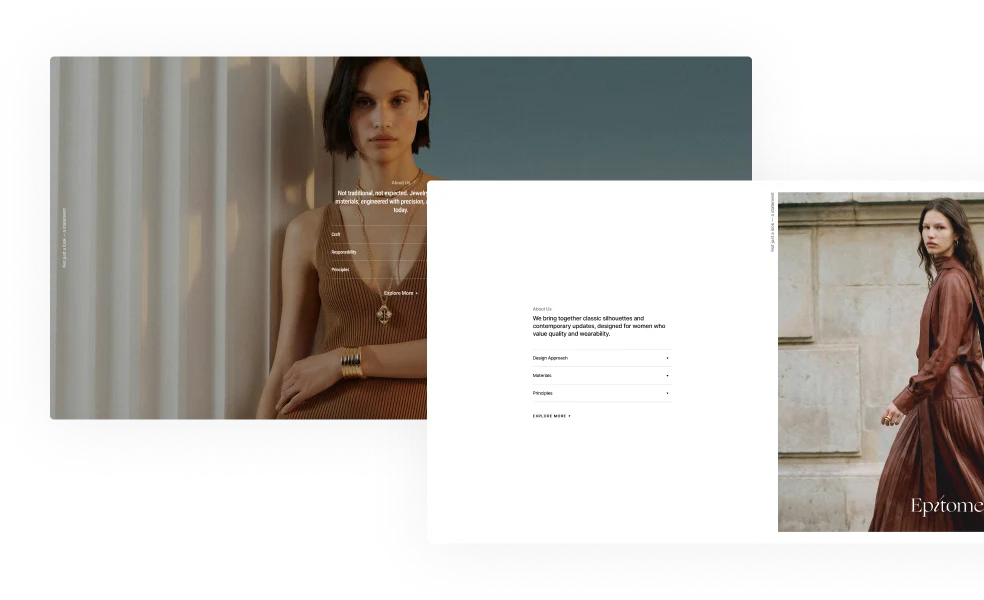
Collections
Flexible Collection Layouts for Better Browsing
Present collections your way — tailored to your brand, catalog structure, and visual direction.
Editorial Scroll Experience
Create immersive collection presentations with layered layouts, scrolling image sections, and editorial-style content blocks.
Tabbed Showcase
Organize collections into interactive tabs that let customers switch between categories without leaving the section.
Flexible Banner Grids
Choose flexible banner grid layouts designed to highlight products, visuals, and featured content in a more organized way.

Promo Section Variations
Banners with Rich Visual Storytelling
Create promotional banner layouts that support everything from product highlights and launches to dynamic campaigns, announcements, and featured visuals.
Flexible Banner Variations
Build flexible promotional layouts with multiple banner grid variations designed to highlight campaigns, featured products, and brand storytelling.
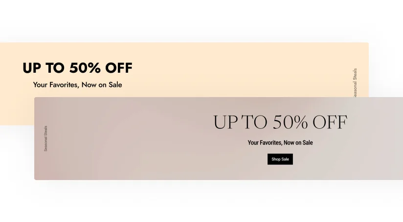
Promotional Text Banners
Highlight sales, announcements, featured products, or store messaging through clean and customizable text-based banner sections.
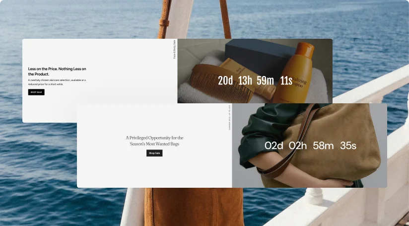
Countdown Timer Banners
Create time-sensitive promotional sections with countdown timers, layered visuals, promotional text, and call-to-action buttons.
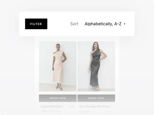
Catalog
Product Filtering Designed for Better Browsing
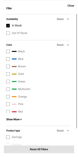
Create cleaner browsing experiences with extensive product filtering options, available in multiple layouts and styles for any storefront.
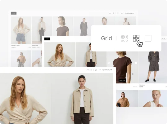
Adaptive Grid Modes
Organize products in 2-, 4-, or 6-column layouts for a browsing experience that fits your brand and inventory.
Sticky Filters
Keep filtering and sorting options visible while browsing collections for faster product navigation and easier adjustments.
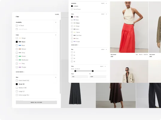
Flexible Filter Layouts
Choose between sidebar filters and modal filter drawers to match different storefront layouts and browsing experiences.
Product Page
Multiple Product Layouts for Different Catalogs
Create more immersive product experiences through flexible visual layouts focused on imagery, details, and product exploration.
Grid Gallery
Present products in a meticulously organized grid format, offering a clean and structured visual experience.
Slider with Previews
Enable easy preview and access to multiple product images below the primary slider for swift image transition.
Stacked Gallery
Showcase product visuals in a vertical stack, bringing every intricate detail into clear focus.
Product Features Built for Conversion
Combine interactive shopping tools and product-focused features to give shoppers the drive to explore your product further.
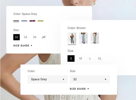
Options
Present colors, sizes, swatches, and variants through flexible option selectors for easier product browsing.
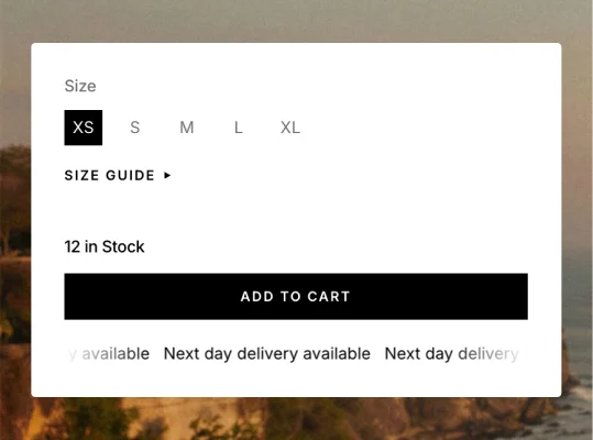
Stock Counter
Show real-time stock levels by size to create urgency and inform customers of product availability more clearly.
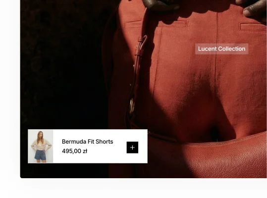
Quick Add Popup
Let customers view and add products to their cart without leaving the page. A fast, seamless shopping experience.
Premium Choice
Build Cleaner, Smarter Storefronts with Epitome
Epitome helps brands create cleaner, more interactive storefronts with flexible sections, modern product layouts, and advanced browsing functionality.
More Product Features
Product Features Beyond the Basics
Create more connected shopping experiences through interactive storefront tools and smoother customer navigation.
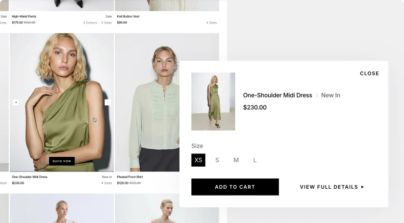
Quick View & Add to Cart
Let customers browse products, select options, and add items to cart without interrupting the shopping flow.
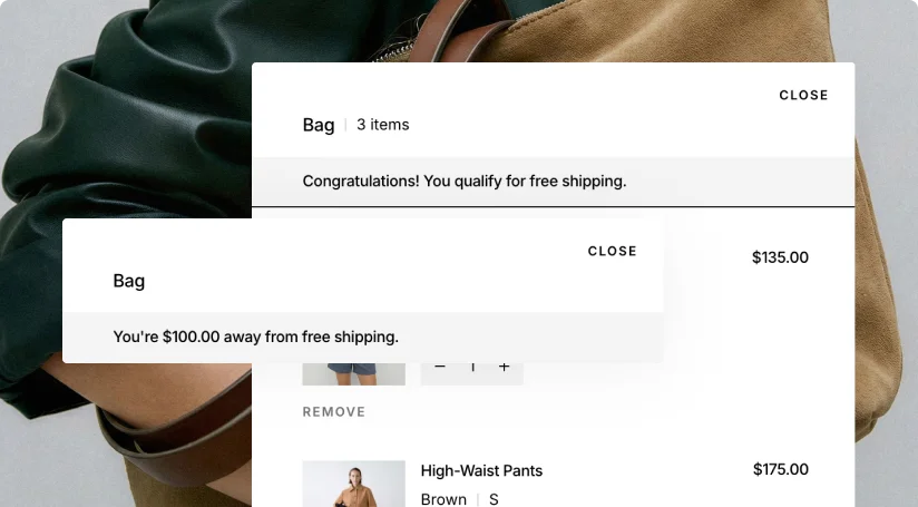
Shipping Reward Tracker
Encourage larger orders with progress-based shopping incentives shown directly throughout the storefront experience.
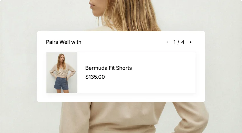
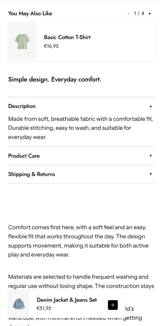
Recommended Products
Keep customers exploring through personalized product suggestions connected to browsing and shopping behavior.
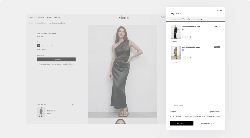
Slide-Out Cart
Enable customers to easily manage their selections on the go, ensuring a smooth, hassle-free shopping experience.
Product Attributes
Highlight key product features and qualities to help customers quickly see what makes each item unique.
Animated Info Ticker
Add motion and visibility to important purchase information with a customizable scrolling message bar.
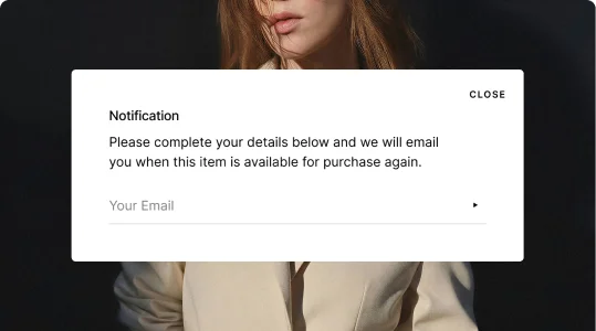
Popup Notification
Keep customers engaged by notifying them when products are back in stock.
Intuitive Navigation
Simple, clear navigation ensures customers easily find what they're looking for, reducing drop-offs.
Speed Optimized
Reduce wait times with pages that load quickly, keeping customers engaged and bounce rates low.
Conversion-Driven
A captivating design that strategically places elements to guide visitors toward a purchase decision.

Switch the Mode Instantly
Let customers switch between light and dark storefront styles in one click through a built-in appearance toggle available across every page.
Mobile Optimization
Mobile-Friendly by Design
Enjoy a full set of powerful mobile-optimized features, offering a native app-like experience.
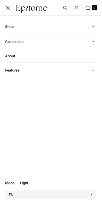
Menu
Keep navigation simple with a mobile-friendly menu designed for faster browsing and easier storefront access.
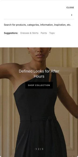
Search
Help customers find products faster through responsive mobile search and streamlined product discovery.

Catalog
Present collections through responsive catalog layouts designed for smooth browsing across smaller screens.
Filters
Allow customers to sort products quickly through mobile-friendly filters and organized browsing options.
Popups
Feature mobile-optimized popups designed to highlight promotions, updates, and important storefront messages.
Product Page
Present product information through structured mobile layouts designed for clearer browsing and easier shopping.
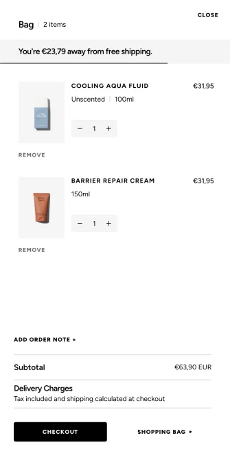
Cart Drawer
Enable faster mobile checkout experiences through responsive cart interactions without leaving the current page.
Product Details
Highlight product information through mobile-friendly layouts designed for easier browsing and faster decisions.


Popups
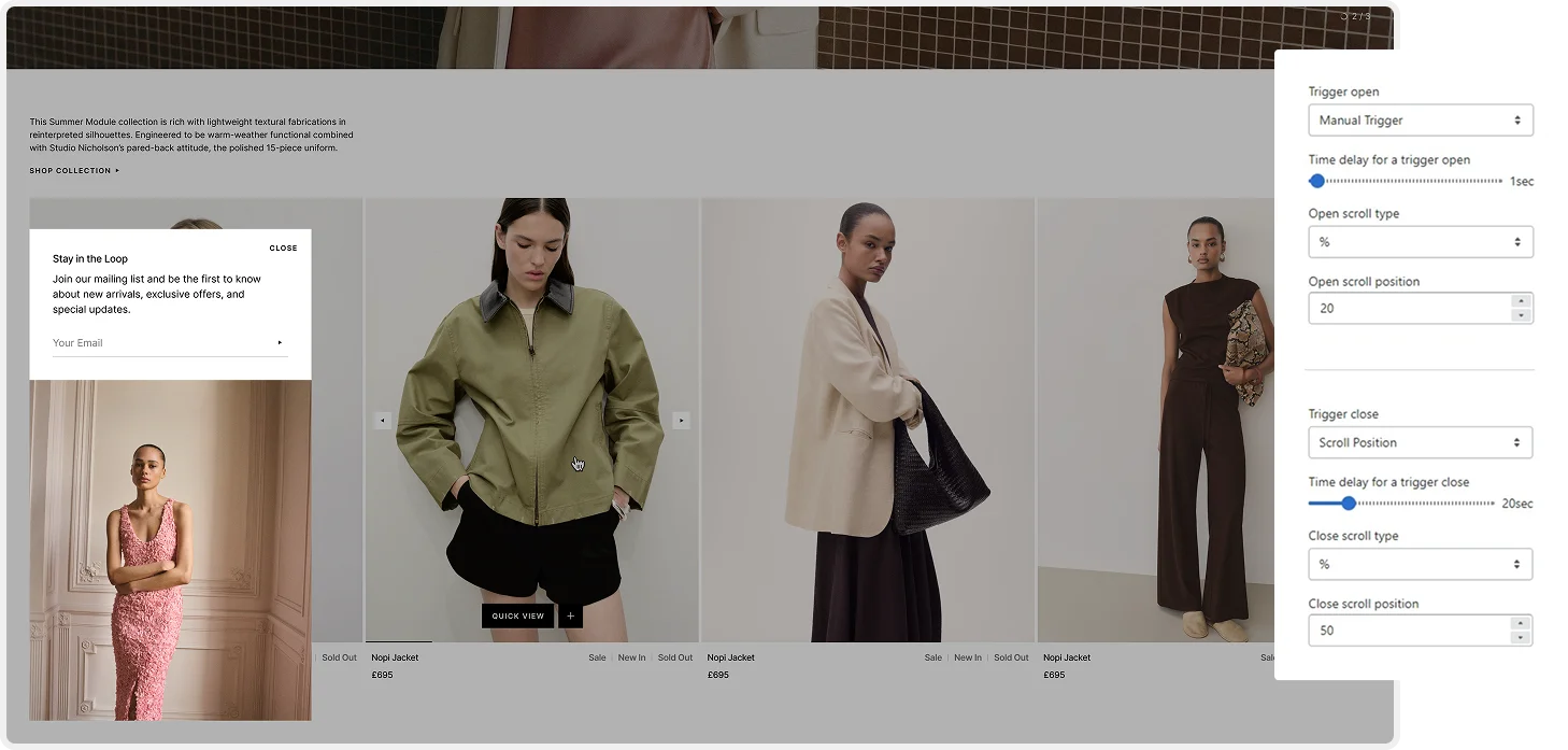
High-Visibility Popup Sections
Discover the different ways to engage your audience with tailored popup triggers. Each popup type is designed to capture attention at the right moment and drive conversions.
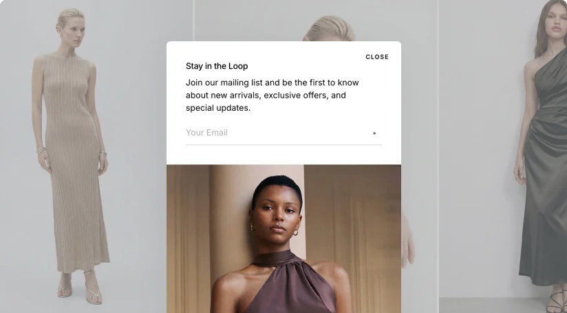
Promotional Popup
Highlight products, announcements, and store updates through image-supported popup layouts across the storefront.
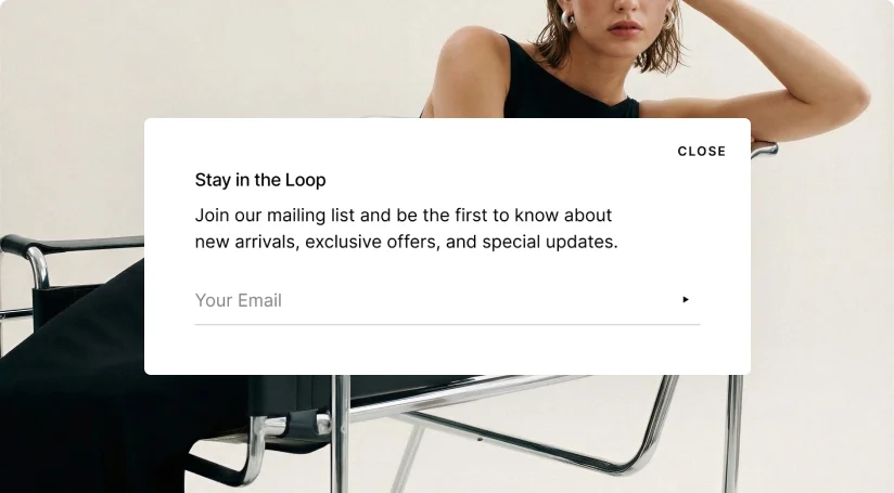
Subscription Popup
Grow your email list through focused signup popups designed for smoother customer engagement.
Scroll
Engage visitors by showing popups once they’ve scrolled to a specific point on the page.
Time Delay
Grab attention with popups that appear after visitors spend some time on your page.
Exit Intent
Show popups when visitors are about to leave, offering discounts or encouraging sign-ups.
Fully Adjustable Popups
Tailor your popups with extensive customization options, ensuring each design and message aligns with your store's style, values, and needs.
Additional features
Better Browsing Starts Here
Optimize your store with conversion-focused tools that drive sales and engage visitors from their very first click.
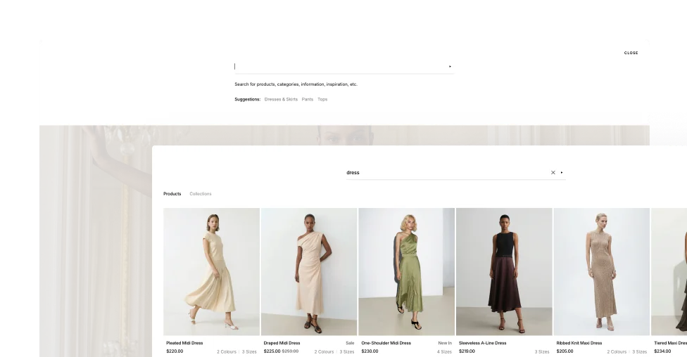
Enhanced Search Tab
Help customers find products quickly — just enter a keyword or letter, and the search takes care of the rest.
Mega Menu
Organize collections, categories, and featured visuals in one expanded multi-column panel for effortless site navigation.
Full-Screen Menu
Give collections and categories the space to stand out with a bold, immersive navigation experience that takes over the full screen.
Logo Position
Control exactly where your logo sits in the header — centered or left-aligned — to best match the layout and feel of your storefront.
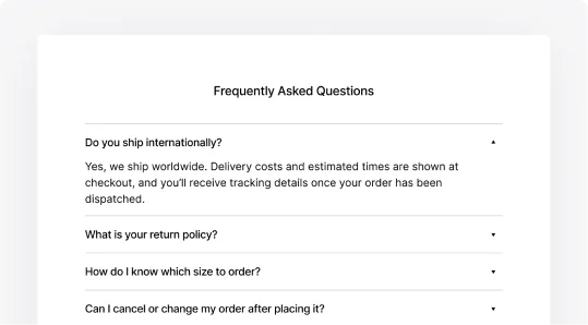
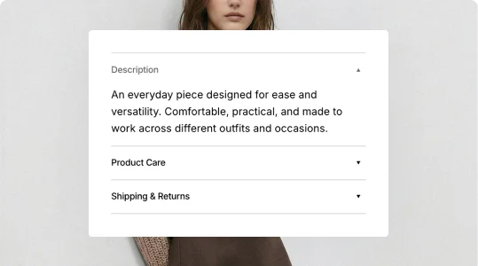
Collapsible Content
Present FAQs, product details, tutorials, and more through clean, collapsible sections that keep pages organized and easy to navigate.
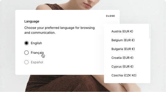
Language & Currency
Let shoppers browse and buy in their preferred language and currency with a convenient, easy-to-access selector built into the storefront.
Unique Sections
Immersive Sections for Better Browsing
Create more engaging storefront experiences through distinctive layouts and visually focused content sections.
Expandable Storytelling
Present editorial content and product highlights through layered layouts with expandable interactive sections.
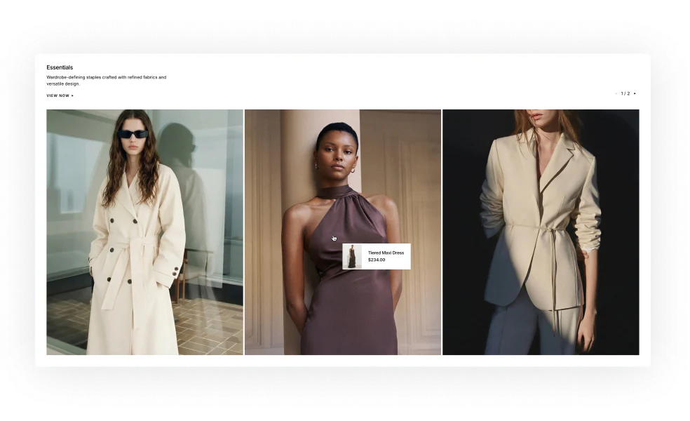
Product Markers
Highlight featured products directly inside imagery through interactive markers designed for connected product discovery.
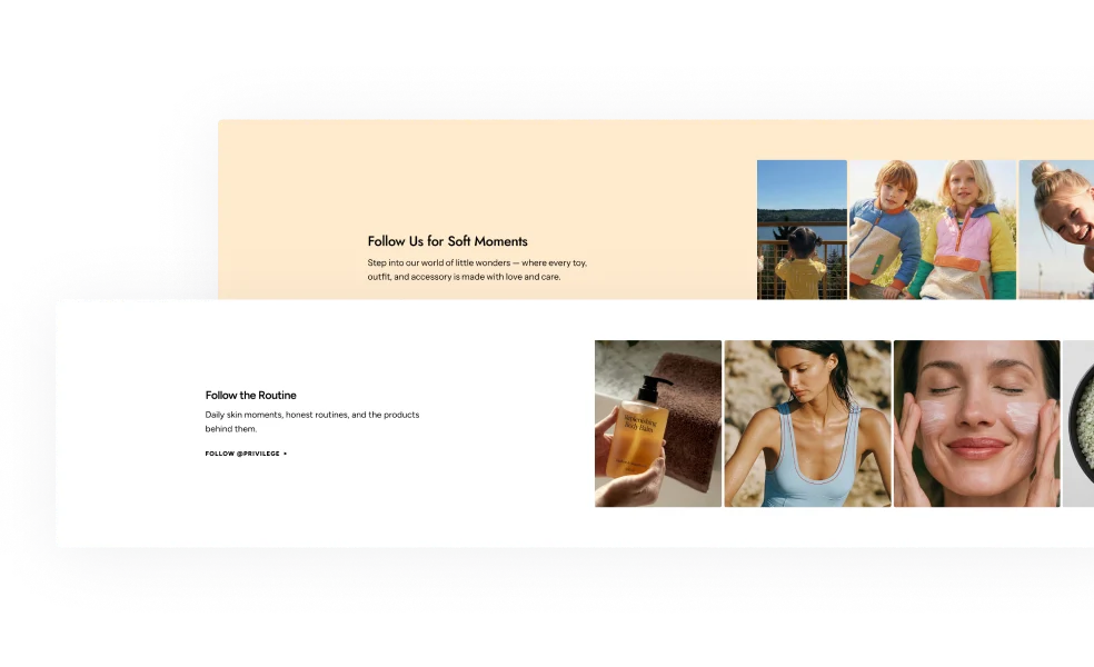
Social Media Collage
Bring together social-inspired layouts, mixed media blocks, and promotional content into more engaging visual experiences.
Cinematic Footer Banner
Extend the storefront experience with large visual footer sections designed for branding, messaging, and promotion.
Blog
Blog Layouts Beyond Standard Posts
Create and publish blog posts, how-to guides, and press releases, and share them instantly on social media with quick-share buttons.
Endless Design Flexibility
Access a wide range of adjustable settings to match your blog's look and feel with your store's unique identity.
Compelling Blog Layouts
Create visually engaging blog pages with layouts that capture attention, keep visitors reading, and encourage them to explore more.
Blog Layout Variations
Create structured blog experiences with layout variations designed for modern editorial and content-focused storefronts.
Sticky Progress Bar with Social Share
Keep article navigation and social sharing accessible at all times through a sticky progress and sharing bar.
More features
More Features. More Flexibility
Use powerful design tools to take your store to the next level, giving you full control over how it looks, feels, and performs.
Infinite Scroll
Load new products automatically as visitors scroll, keeping them engaged without interrupting their browsing flow.

Age Verifier
Restrict access to age-sensitive content with a customizable verification prompt that appears before entering the store.
Sticky Header
Keep navigation always within reach by fixing the header to the top of the page as visitors scroll through the store.
Smart Notification Bar
Deliver announcements, promotions, and updates through a slim, attention-grabbing bar displayed across the top of the storefront.

Back-to-Top Button
Allow customers to instantly jump back to the top of the page for easier navigation and smoother browsing experiences.
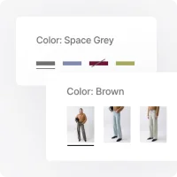
Color Swatches
Let customers see products in different colors and variations before making a purchase, helping them shop with more confidence.
One-of-a-Kind Support You Can Rely On
Receive a response within 15 minutes: any hour, every business day. Even during your trial, we're here whenever you need us. Choose the option that works best for you.

Live Chat Online •
Real-time help from our Support team
Submit Tickets
Request a Fix or Customization
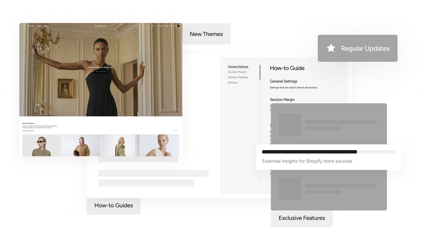
Documentation
How-to guidance for theme setup and use
Minimal Design. Modern Commerce
Start with a More Powerful Storefront with Epitome
Built for stores that need both flexibility and performance, delivering modern browsing systems, clean aesthetics, and advanced storefront functionality.